Supporting Families & Farmers
Through the Coronavirus Crisis.

Supporting Families & Farmers Through the Coronavirus Crisis.

Connecting local farms to get fresh produce to the San Francisco Bay Area's most vulnerable households

Connecting local farms to get fresh produce to the San Francisco Bay Area's most vulnerable households

view of fffr cloud storage app screens view of colorful app screens

The Problem

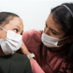
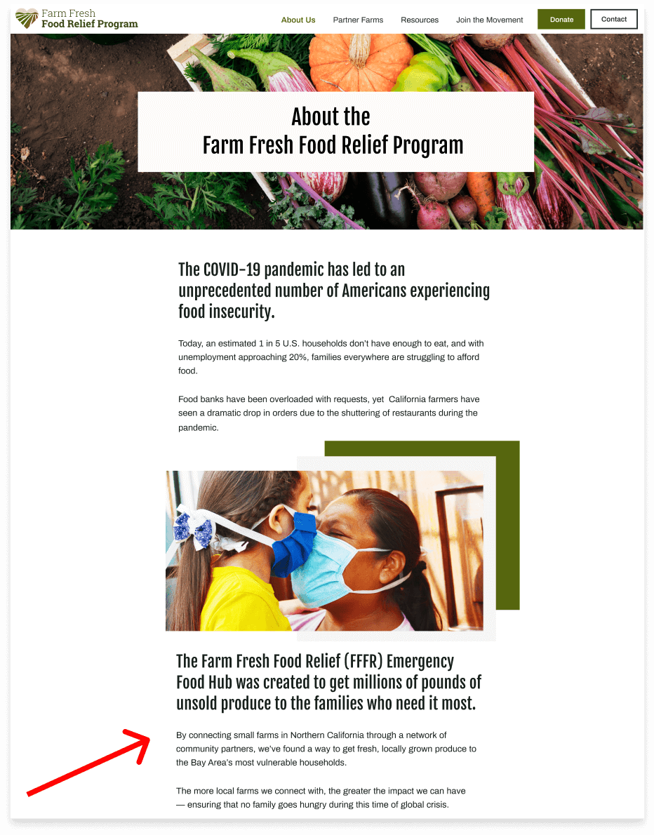
The COVID-19 pandemic has led to an unprecedented number of Americans experiencing food insecurity.

Due to widespread unemployment and economic instability during the coronavirus pandemic, an estimated 1 in 5 U.S. households did not have enough to eat as of April 2020.

While food banks were overloaded with requests, California farmers were forced to let food rot in the fields, as their primary customers — restaurants — were shuttered during the early days of the pandemic.

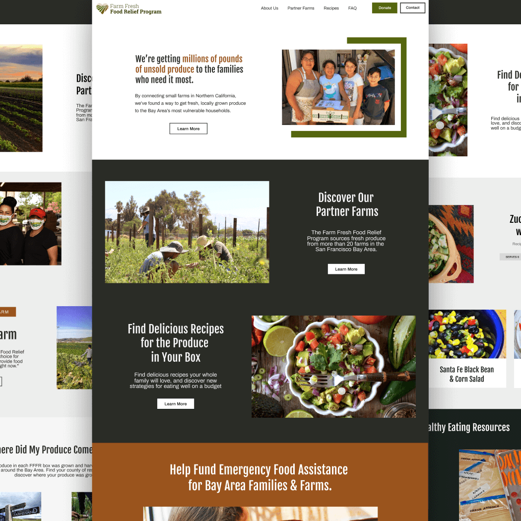
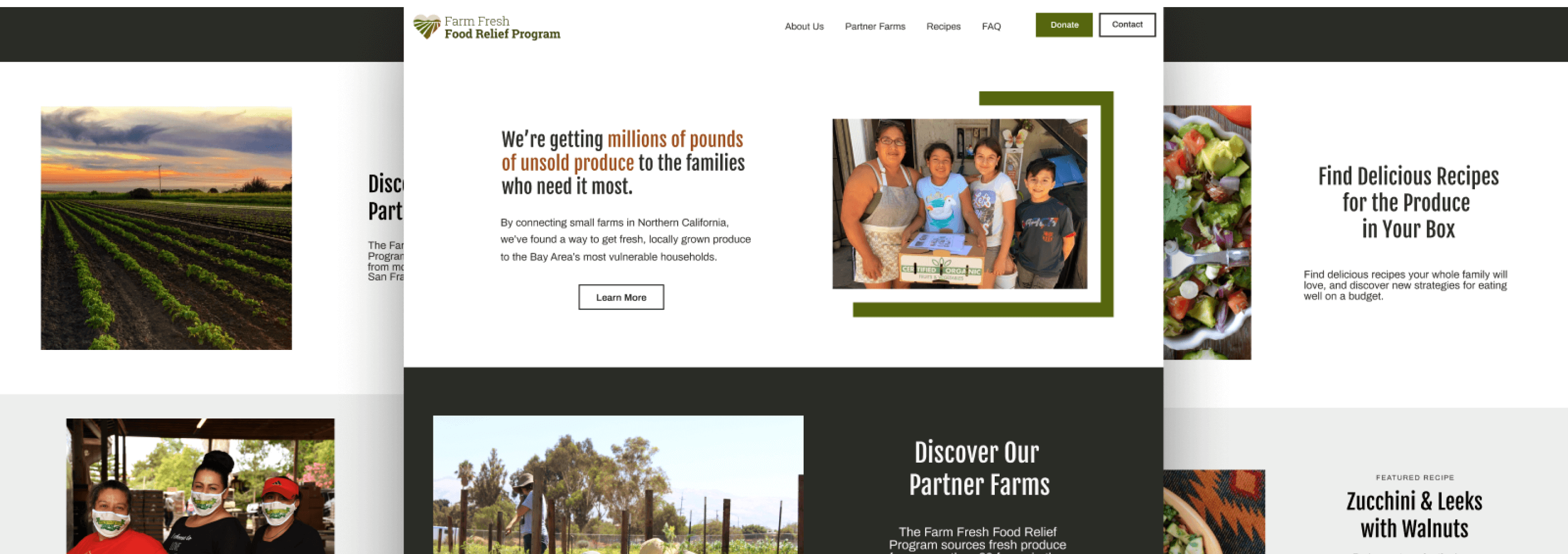
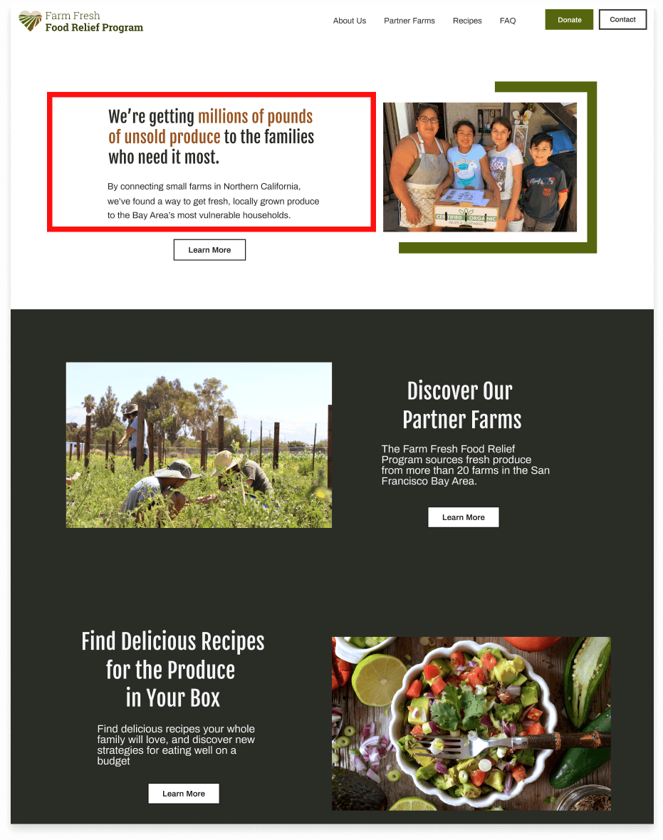
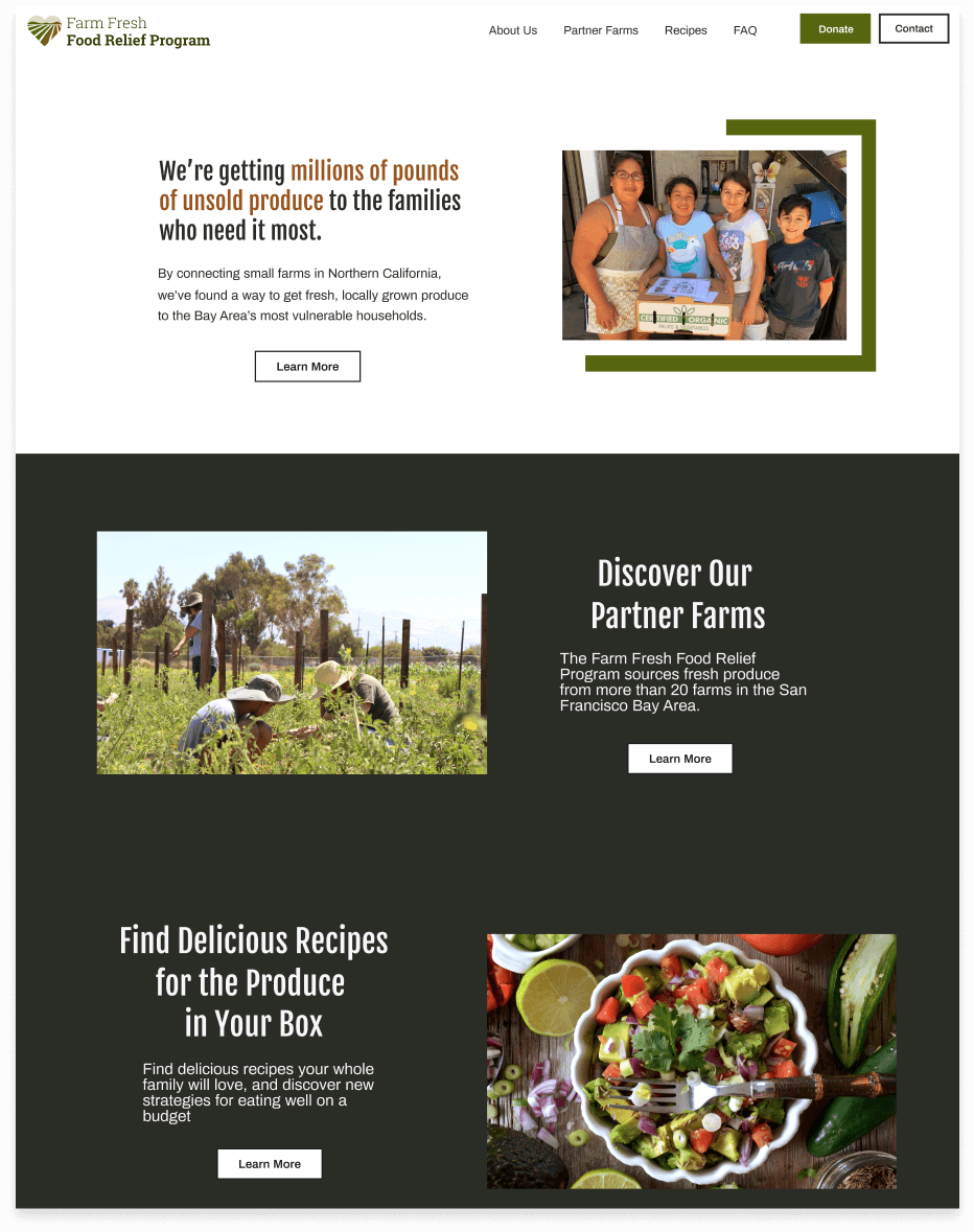
To support both food banks and struggling small farms, a coalition of non-profit organizations and small farms formed the Farm Fresh Food Relief (FFFR) Emergency Food Hub to distribute millions of pounds of unsold fruits and vegetables to the Bay Area's most vulnerable households.

While the program began with a distribution of 200 hundred boxes per week, a $2.6 million contract from the US Department of Agriculture allowed for a major expansion of the program. By May, the program had funding to serve 86,000 families in seven counties over a 7-month period.

illustration of two students climbing a hill
illustration of a student smiling while studying at home in front of a laptop

The Solution

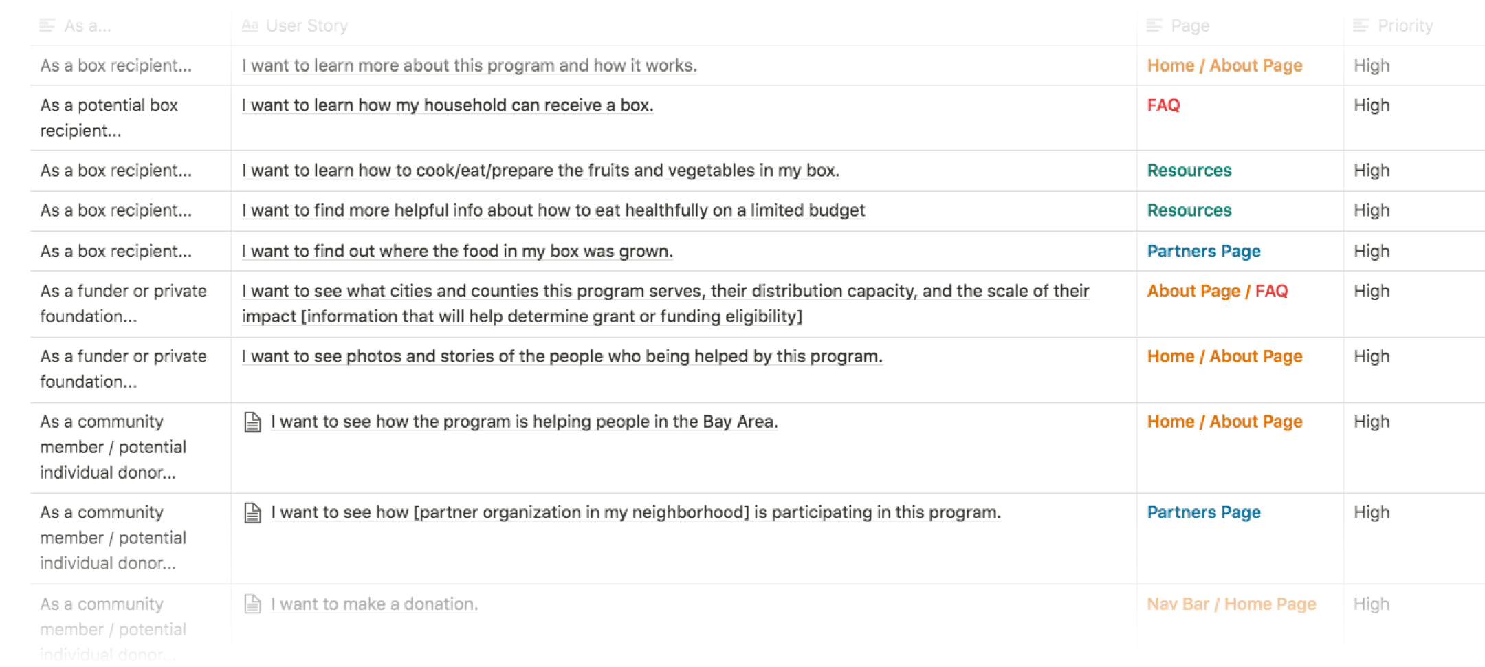
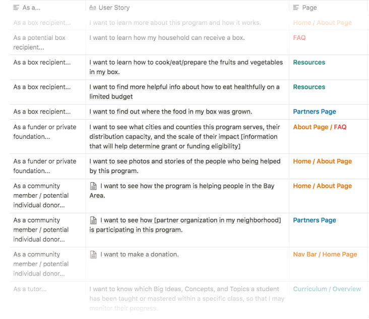
Build a resource that works for both project funders and people in need.

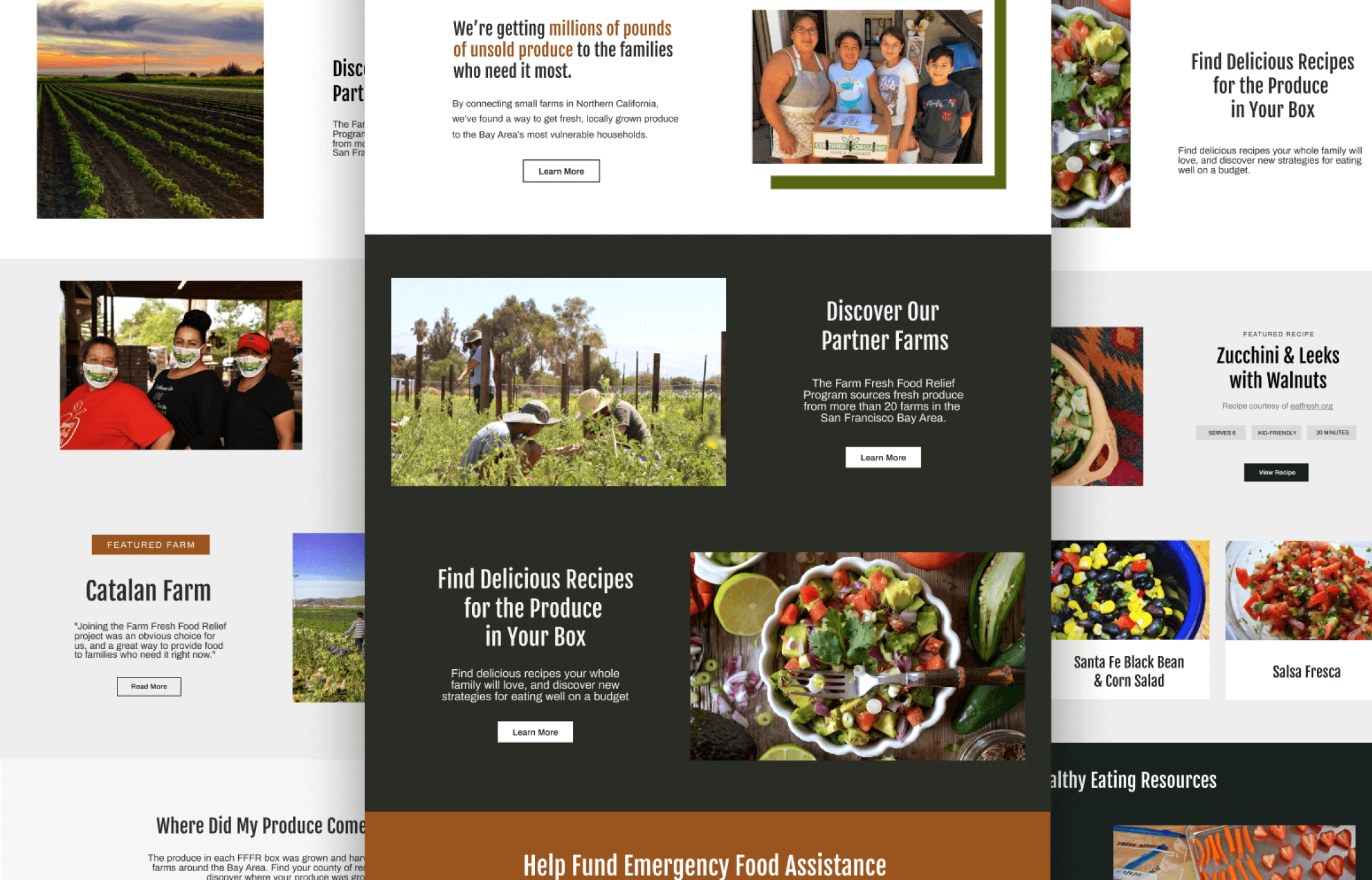
To increase public awareness of the program, seek additional funding streams, and serve as a resource for recipients of the free produce boxes, I worked with project leaders to design and develop the program's website, farmfreshfoodrelief.org.

We knew this needed to be a resource for both box recipients and potential funders, so language and styling had to be appropriate for both groups.

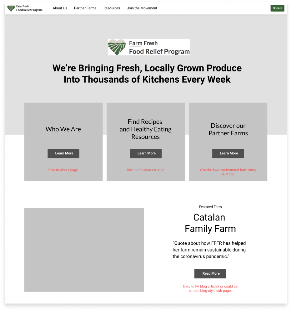
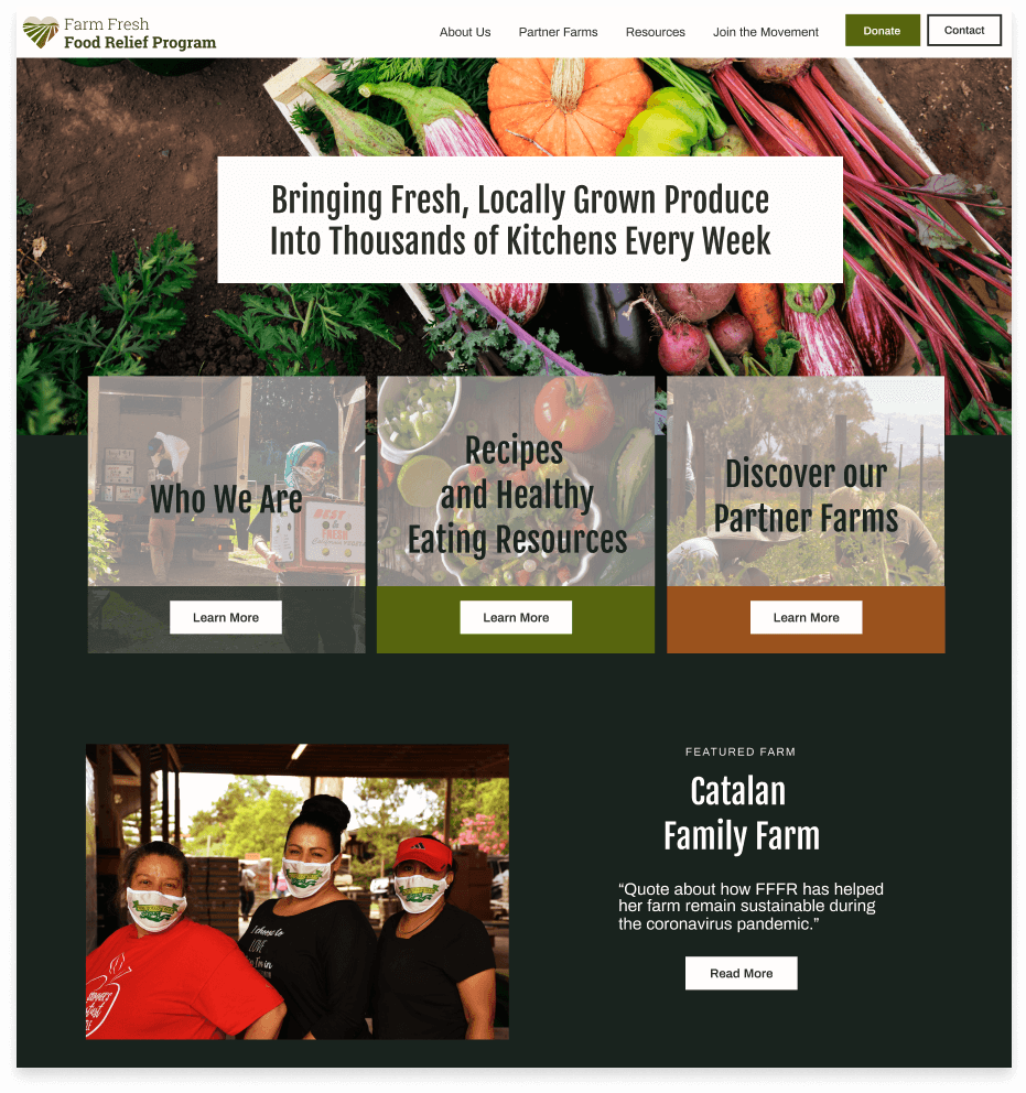
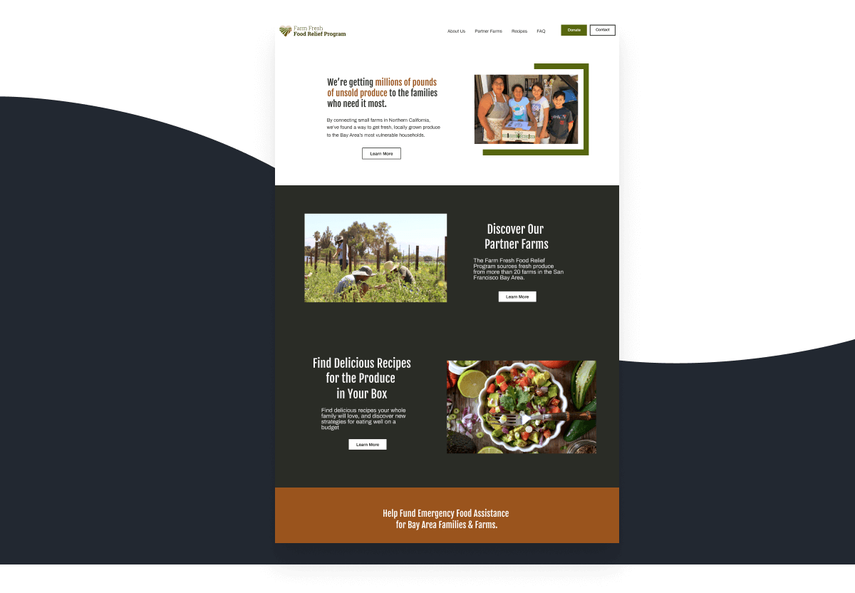
This site was developed in two phases: the first phase (MVP) involved simple wireframes and minimal branding before development and launch. The second phase involved a much deeper dive into user needs, branding, a style guide, usability testing, new low and hifi mockups, and a significant expansion of site content.

The first site launch occurred with FFFR's first major press release the first week of June. This PR campaign led to major press exposure as well as a 2.6$ million dollar contract from the US dept of agriculture. As a result, the program grew in capacity to serve 86,000 families in seven counties over a 7-month period.

By serving as a central information hub for food box recipients, the site also helped save thousands of dollars in printing costs, while giving struggling families high-quality resources for eating healthfully on a limited budget.

Role:

Lead UX/UI Designer, Front End Developer, Project Manager

Team:

Program Director, Junior Graphic Designer, Program Directors and/or Marketing Managers from over 20 Partner Organizations

Deliverables:

User Research, User Personas, User Stories & Flows, Wireframes, Usability Testing, High Fidelity Mockups, Development

Tools:

Figma, Adobe CC, Bootstrap, CSS/HTML/JS

Duration:

10 weeks

Phase 1: The MVP

Within weeks of the March 2020 shelter-in-place order in the San Francisco Bay Area, the FFFR Emergency Food Hub was distributing their first boxes of locally grown produce to families in need.

This meant that an initial brand identity, early print marketing materials (for placing inside the food boxes), and a website with basic information about the program needed to be created rapidly to help solicit the first major round of funding.

The first version was a simple landing page, designed specifically with funders in mind. It was created using basic bootstrap styles, and the language was taken directly from an early funding pitch.

This no-frills design was launched in just over a week, and the design process consisted of simple wireframes and minimal branding before development and launch.

Phase 2: Redesigning for Multiple User Types

After the MVP was launched, there was time to step back and consider how the website could fully support the program and all of it's potential users.

I began this phase with a series of meetings with project stakeholders, primarily representatives from the partner organizations and local farms who were participating in the project.

In these conversations, I asked careful questions to get a strong sense of who this website was for, how this website could help solve communication problems and reduce costs, and when the second version needed to be complete. From here, I created a timeline for myself and jumped into the design process.

Part One

Understanding the Users

Creating Proto Personas

Having worked with food access non-profits for several years, I had a strong intuition for who the stakeholders would be on this project.

Using this knowledge, I drafted a series of proto-personas to guide the design process, as I knew that there likely wouldn't be time for comprehensive user surveys and interviews.

The project team leaders helped me brainstorm a list of potential needs and challenges faced by our stakeholders, which helped the group come to alignment on the critical requirements for the second phase of the FFFR site. While proto-personas are no replacement for actual quantitative and qualitative data, they can be incredibly useful when time is in short supply.

This site was developed for three user groups with very different needs:

The Program Participant

House Cleaner, 40
Pescadero, CA

Mother of three who is recipient of free food boxes

  • Needs information about what to do with the (possibly unfamiliar) foods in the box
  • Has limited internet access and/or only mobile access
  • May speak limited English

The Grant Administrator

Grant Manager, 51
Sacramento, CA

Represents private foundations or the US Department of Agriculture

  • Needs information about program scale and capacity to determine eligibility for funding
  • Has limited time to review each grant applicant

The Individual Donor

Chef, 37
Oakland, CA

Local community member on the email list of a partner nonprofit

  • Needs information about what to do with the (possibly unfamiliar) foods in the box
  • Has limited internet access and/or only mobile access
  • May speak limited English

User surveys and interviews were an unfortunate omission from this stage of the project. Getting input from box recipients at this phase would have been enormously helpful, however a tight launch schedule prohibited me from getting input from the users themselves.

Part Two

Site Structure

The first version of the site consisted of a simple homepage with basic program information, a contact button, and a link to an external crowdfunding to support the program.

To support the needs of all of our users, I looked to the needs and pain points of my proto-personas for a list of features to include in the second launch. I turned into user stories, which then informed the sitemap.

Part Three

Branding & Visual Design

The first version of farmfreshfoodrelief.org used standard css colors DarkGreen (#006400) and ForestGreen (#228B22) for simplicity. I used Lato for the logo and all web and print typography in the first phase of the project, because of it's clean lines, friendly curves, and readability at all point sizes.

Before designing hifi mockups of my updated wireframes, I selected a color palette to better suit the earthy, organic, rural-meets-urban, helpful and accessible tone of the brand.

#19231E

#56660E

#9A541D

#DFD7C5

#F4F5F3

For large headings, I used Fjalla One for it’s high impact and contrast. I choose Archivo for body text, interactive elements, and smaller headlines due to it's high readability and angular letterforms, which mirrored the right angles and flat terminals of Fjalla One.

photo collage and color swatches photo collage and color swatches photo collage and color swatches photo collage and color swatches

I updated the logo with my new palatte, but ultimately chose Roboto Slab for the program name because it more strongly reflected the farm theme.

Part Four

From Wireframes to Hifi Mockups

In a perfect world, I would have tested the site's functionality with actual users from the beginning. But the project’s rapid timeline, combined with difficulty finding testers who met the minimum technical requirements of screen sharing in a zoom call (a large percentage of the box recipients had poor internet connectivity and used older devices) led to significant delays in recruiting the first group of testers.

Shortly after the second version of the site had launched, I finally had an opportunity to complete a series of in-depth interviews and testing with several box recipients. In the following sections, you can see how different parts of the site evolved in response to feedback from user testing and other key stakeholders.

Improving Legibility

Some of the biggest priorities of the collaborative were to highlight the importance of local farms in the Bay Area food system, explain how the program works in a simple way, and use lots of photos to illustrate the many partner organizations involved in the project.

greyscale wireframe

The response to showing the wireframe on the left: photos behind all of these content blocks please!

greyscale wireframe

The response to showing the wireframe on the left: photos behind all of these content blocks please!

However, user testing with actual box recipients showed that site visitors often had a difficult time reading the text overlaying the images.

photo collage and color swatches

In the third and final version of the home page, these content blocks were redesigned to lean on a simpler palette of grey tones, with text displaying below the image rather than on top.

Clarifying the Message

User testing indicated that people didn't really understand what the program was about when first landing on the homepage. The best and most succinct explanation for the program was actually buried halfway down the About page, where few users were likely to scroll. So the homepage was redesigned with this copy rewritten for the hero, with a photo of a smiling family holding their FFFR box replacing the generic stock photo of fresh produce.

greyscale wireframe

The landing page doesn’t really explain what the program is — this information is buried in the About Us page.

greyscale wireframe

The landing page doesn’t really explain the purpose of the program — it's buried in the About Us page.

Now it’s visible in the hero block of the landing page.

Creating Clear Pathways to Content

In testing sessions, users tended to completely miss the “resources” and recipes section of the site. When asked to assess the purpose of the site and what they could do there, most testers scrolled around the homepage, clicked on “about the program,” and conclude they had seen everything.

Google analytics data painted a similar picture, and showed that the vast majority of users would land on the homepage, scroll around for about 1.5 minutes, click to the About Us page, and then leave after another minute or so.

Users are clearly not finding the resources page — or don’t think it looks relevant to them.

In retrospect, this was a pretty clear consequence of not testing the site with box participants earlier in the process. Most planning meetings consisted of 6-10 representatives from partner farms and non-profits wanting to make sure that their organization was proudly shown on the homepage, leading to an experience that strongly emphasized the role of local farms in the program — while simultaneously de-emphasizing free resources for the box recipients.

greyscale wireframe

The majority of the homepage in version 2 talks about local farms. Healthy eating resources are scarcely mentioned.

greyscale wireframe

The majority of the homepage in version 2 talks about local farms. Healthy eating resources are scarcely mentioned.

In version 3, farms and resources are given equal weight and the list of partner farms moves to the new Partner Farms page.

To resolve this, version three of farmfreshfoodrelief.org moves the majority of the farm content (blogs, interviews, lists of participating farms by county) to the "Farms" page. This content can be quickly reached from the Discover Our Partner Farms content block sitting directly below the fold on the homepage, which is followed by a Find Delicious Recipes content block linking to the Resource page.

photo collage and color swatches
Part Seven

Key Takeaways

The importance of being a user advocate.

One of the biggest challenges of this project was effectively balancing the needs of all the users. Farms and their fans + followers were themselves a user group — they wanted positive PR, to demonstrate to the local community that they were being proactive and a part of the solution, that they were a critical resources. Farms need to feel their story is being told, but it needs to be told in a way that both box recipients and potential funders would find valuable.

In the planning meetings for this project, several experienced grant writers argued for the needs of funders, while farms were over-represented as a user group — sometimes as many as 12 representatives from various partner organizations were in each meeting!

With no box recipients present, I worked hard to make sure that their needs and interests were heard in the conversation. By serving as the advocate for stakeholders that were not in the room, I was able to be a much better resource for arguably the most important users: vulnerable households struggling with food insecurity during the pandemic.

A part of something big

Overall, I'm very proud of the project that my team developed in an incredibly short period of time. As of this writing, over 83,000 households in 9 Bay Area counties have received boxes of healthy, locally grown fruits and vegetables. While the rapid launch and iteration of farmfreshfoodrelief.org played a significant role in the marketing campaign and subsequent fundraising successes, I'm humbled by the hard work of all the partner farms, food pantries, non-profit staff, and volunteers who came together to support their community during a time of unprecedented crisis.